Congratulations, in the last post you have successfully created your first PowerApp.
In this post, we will try to understand different controls available in PowerApps. Before jumping directly into PowerApps one quick tip wants to share with you that PowerApps is very much inspired by Excel. So, whenever you stuck to any problem which you want to solve than just give a try how you could solve that particular problem in Excel. You will find most of the functions similar to Excel.
Just remember that screen & its controls have global scope in PowerApps.
PowerApps support various controls which we will discuss shortly but before that would like to share that every control has properties and these properties has 2 types Input properties and output properties. We can update the input properties but not output properties.
with this let’s start controls:
You can use control by clicking on control’s icon of Insert menu
Label:- Label is simple a ready only control to show text value. We can change the properties like font, color, position, size etc.. from properties window.
You can write a custom function for any input properties or assign direct value.

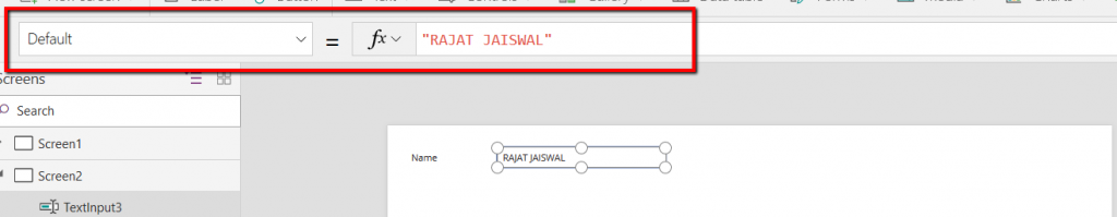
TextBox : When we need input from the user then in such cases we can use Textbox control. For example, asking the name of the person.
Just to make you aware Text property is Output property of textbox so you can’t assign value. while Default is in the input property to show any value in the textbox.
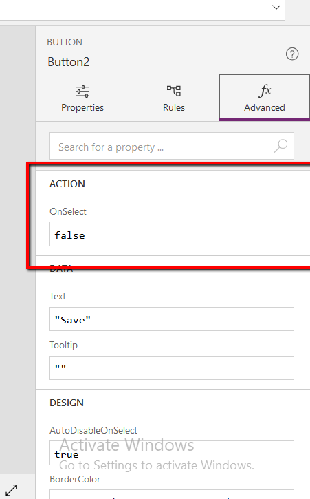
Button: Button control is used to perform any action by clicking on it. You can write custom action using the OnSelect trigger.
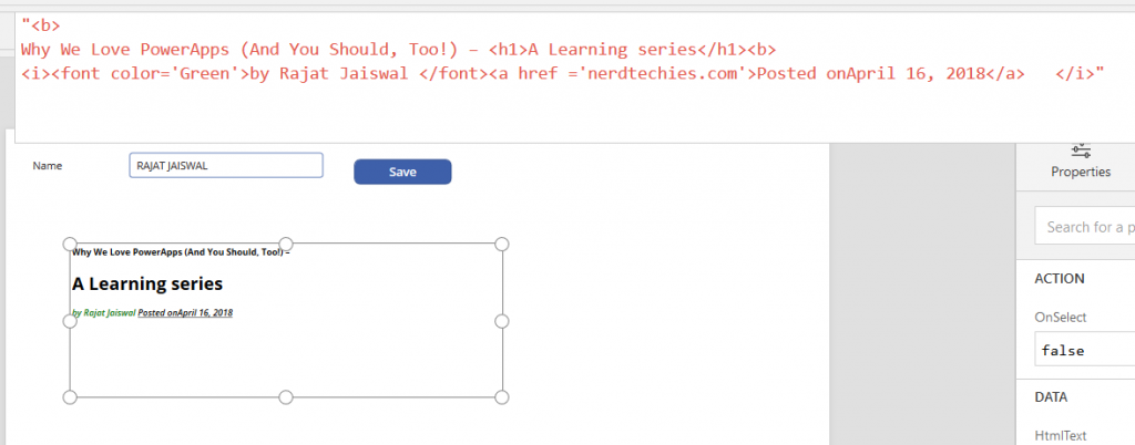
HtmlText : When we have to deal with Html Data then in such cases we can use HTML textbox.
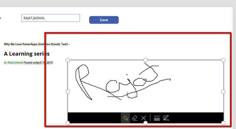
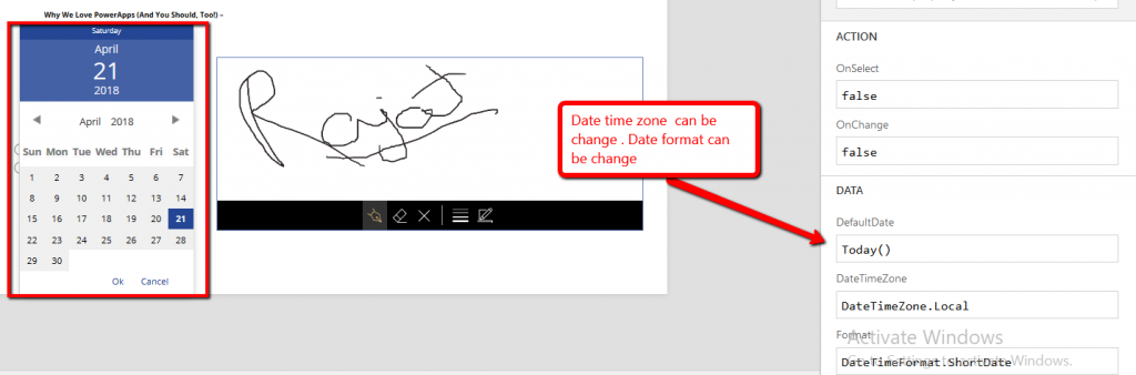
Pen Input: This is one of the interesting control. When you need pen input from Apps like a signature or something that then you can use this control

Date Picker : When you want date value then in such case we can use Date Picker control. We have provision to change DateTime format & time Zone from Local to UTC.
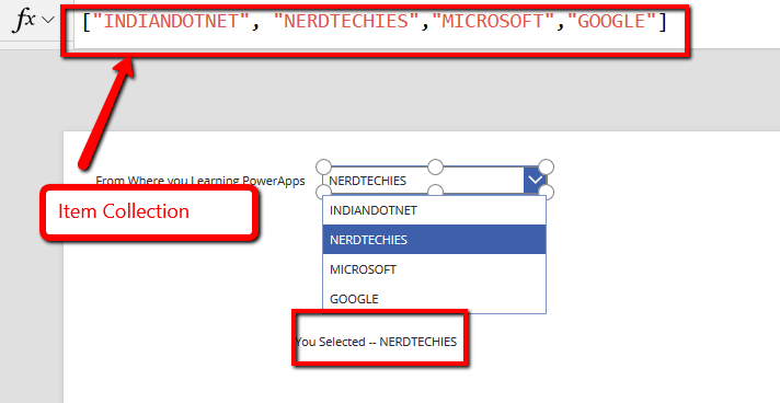
DropDown:- Whenever we have multiple options from which we need to select the value then we can use DropDown control. DropDown control has Items properties to bind the dropDown options. If a user selected any Dropdown option then we can get by Selected property of dropdown.
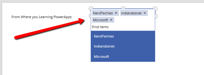
Combobox:- Combobox most likely a DropDown and also provide multi selection option.
Rating :- If we want a rating for a specific reason then we can use Rating control.

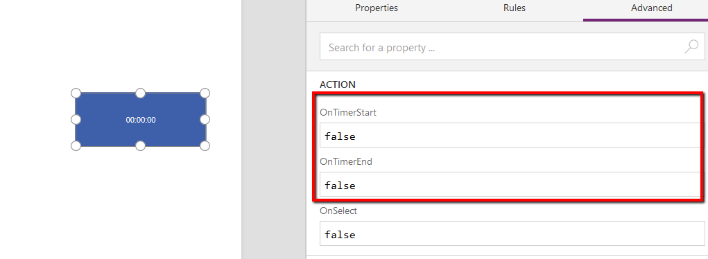
Timer: By the name, it is clear that it is a timer which starts counting. You can invoke an event on OntimerStart, OnTimerEnd etc..
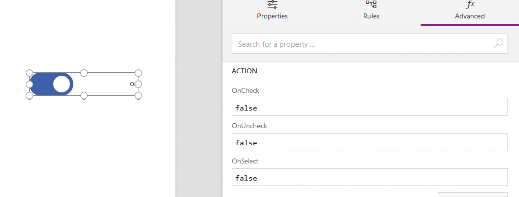
Toggle: Toggle is just True/False option. So, whenever you want true/false option we can use it.
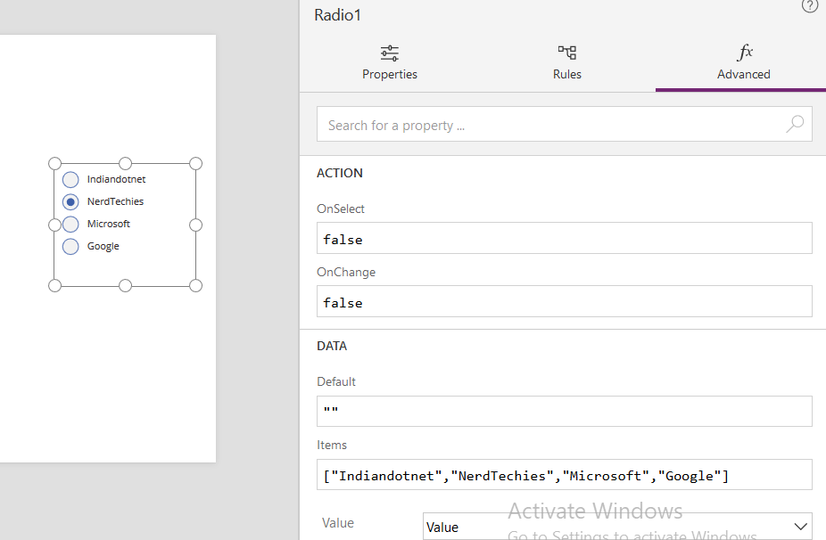
Radio Button: Radio button is again normal control which you might have used earlier. You have a list of option and you need to select a specific option then we can use a radio button.
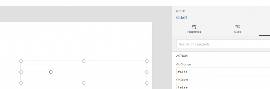
Slider: When we required a predefined range and want a user to select from that particular range then the slider is one of the options.
Apart from this there some other controls like Form Control, Grid, Attachment etc.. which we will describe soon in our coming post as they need individual attention.
Till then enjoy reading.
